01-28-2013, 03:42 PM
update / font test 1
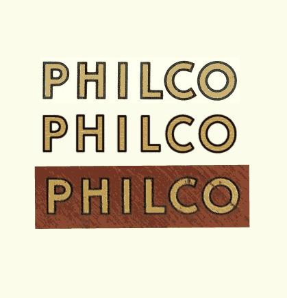
I believe Bob's, even with what Ron uploaded, is the closest match so far. I've only performed a few quick matches (scanning a few hundred fonts), but those coming close aren't any closer than Bob's find.
I ran a test to see it in action and while there are a few minor "tells," the font as is, is very close. It took just the slightest tweaking using quick layout tricks, but I got it even closer than what it was "out of the box" typing.
I could take it further and deconstruct these faults and manually add the needed fixes, but arguably one could use this font (with only the few quick adjustments as I did) and have it be ok, IMHO, especially if you were creating type for dials etc., and not the logotype.
Given the already small point sizes used on the dials (plus any relic'ing one might do) deviations would become minuscule to all but the knowing eye.
Here's what I mean. Here is my test with two models (not saying which is which). At quick glance, it could pass, IMHO.
Imagine this much smaller, even more so.

What do folks think? I think it makes a great quick go-to, at least to serve as a safe font for when less than 100% accurate restoration is required.
That being said, if it passes the eyes of the more experienced masters here in the Phorum, I can proceed to make some 56-1201 dial type for print. (I'd share my work of course with anyone who asks.)
But I'm getting ahead of myself. What do the more experienced eyes here see? If this is a good foundation, I can nudge it further so it's an exact match if you're curious, and run it past the assembled again. Then at least we would all have a Phorum blessed logotype resource to share and build upon (e.g., getting other odd decals made, tee shirts, beer steins, personalized Chuck Taylors, etc.,)
I believe Bob's, even with what Ron uploaded, is the closest match so far. I've only performed a few quick matches (scanning a few hundred fonts), but those coming close aren't any closer than Bob's find.
I ran a test to see it in action and while there are a few minor "tells," the font as is, is very close. It took just the slightest tweaking using quick layout tricks, but I got it even closer than what it was "out of the box" typing.
I could take it further and deconstruct these faults and manually add the needed fixes, but arguably one could use this font (with only the few quick adjustments as I did) and have it be ok, IMHO, especially if you were creating type for dials etc., and not the logotype.
Given the already small point sizes used on the dials (plus any relic'ing one might do) deviations would become minuscule to all but the knowing eye.
Here's what I mean. Here is my test with two models (not saying which is which). At quick glance, it could pass, IMHO.
Imagine this much smaller, even more so.
What do folks think? I think it makes a great quick go-to, at least to serve as a safe font for when less than 100% accurate restoration is required.
That being said, if it passes the eyes of the more experienced masters here in the Phorum, I can proceed to make some 56-1201 dial type for print. (I'd share my work of course with anyone who asks.)
But I'm getting ahead of myself. What do the more experienced eyes here see? If this is a good foundation, I can nudge it further so it's an exact match if you're curious, and run it past the assembled again. Then at least we would all have a Phorum blessed logotype resource to share and build upon (e.g., getting other odd decals made, tee shirts, beer steins, personalized Chuck Taylors, etc.,)


![[-] [-]](https://philcoradio.com/phorum/images/bootbb/collapse.png)


